Students apply what they know about light polarization and attenuation (learned in …
Students apply what they know about light polarization and attenuation (learned in the associated lesson) to design, build, test, refine and then advertise their prototypes for more effective sunglasses. Presented as a hypothetical design scenario, students act as engineers who are challenged to create improved sunglasses that reduce glare and lower light intensity while increasing eye protection from UVA and UVB radiation compared to an existing model of sunglasses—and make them as inexpensive as possible. They use a light meter to measure and compare light intensities through the commercial sunglasses and their prototype lenses. They consider the project requirements and constraints in their designs. They brainstorm and evaluate possible design ideas. They keep track of materials costs. They create and present advertisements to the class that promote the sunglasses benefits, using collected data to justify their claims. A grading rubric and reflection handout are provided.
This task uses student generated data to assess standard 7.SP.7. This task …
This task uses student generated data to assess standard 7.SP.7. This task could also be extended to address Standard 7.SP.1 by adding a small or whole class discussion of whether the class could be considered as a representative sample of all students at your school.
Using thermometers, cotton balls, string and water, students make simple psychrometers—a tool …
Using thermometers, cotton balls, string and water, students make simple psychrometers—a tool that measures humidity. They learn the difference between relative humidity (the ratio of water vapor content to water vapor carrying capacity) and dew point (the temperature at which dew forms). Teams collect data using their homemade psychrometers and then calculate relative humidity inside and outside, comparing their results to an off-the-shelf psychrometer (if available). A lab worksheet is provided for data collection and calculation. As a real-world connection, students learn that humidity and air density is taken into consideration by engineers for many design projects. To conclude, they answer and discuss analysis and application questions.
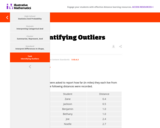
This is a task from the Illustrative Mathematics website that is one …
This is a task from the Illustrative Mathematics website that is one part of a complete illustration of the standard to which it is aligned. Each task has at least one solution and some commentary that addresses important aspects of the task and its potential use.
Short video which describes the difference between a sample and a population. …
Short video which describes the difference between a sample and a population.
Khan Academy learning modules include a Community space where users can ask questions and seek help from community members. Educators should consult with their Technology administrators to determine the use of Khan Academy learning modules in their classroom. Please review materials from external sites before sharing with students.
Much of statistics is based upon using data from a random sample …
Much of statistics is based upon using data from a random sample that is representative of the population at large. From that sample mean, we can infer things about the greater population mean. We'll explain.
Khan Academy learning modules include a Community space where users can ask questions and seek help from community members. Educators should consult with their Technology administrators to determine the use of Khan Academy learning modules in their classroom. Please review materials from external sites before sharing with students.
Sal shows examples of intersection and union of sets and introduces some …
Sal shows examples of intersection and union of sets and introduces some set notation.
Khan Academy learning modules include a Community space where users can ask questions and seek help from community members. Educators should consult with their Technology administrators to determine the use of Khan Academy learning modules in their classroom. Please review materials from external sites before sharing with students.
Introduction to experiment design. Explanatory and response variables. Control and treatment groups. …
Introduction to experiment design. Explanatory and response variables. Control and treatment groups.
Khan Academy learning modules include a Community space where users can ask questions and seek help from community members. Educators should consult with their Technology administrators to determine the use of Khan Academy learning modules in their classroom. Please review materials from external sites before sharing with students.
This is a task from the Illustrative Mathematics website that is one …
This is a task from the Illustrative Mathematics website that is one part of a complete illustration of the standard to which it is aligned. Each task has at least one solution and some commentary that addresses important aspects of the task and its potential use.
Distributions and Variability Type of Unit: Project Prior Knowledge Students should be …
Distributions and Variability
Type of Unit: Project
Prior Knowledge
Students should be able to:
Represent and interpret data using a line plot. Understand other visual representations of data.
Lesson Flow
Students begin the unit by discussing what constitutes a statistical question. In order to answer statistical questions, data must be gathered in a consistent and accurate manner and then analyzed using appropriate tools.
Students learn different tools for analyzing data, including:
Measures of center: mean (average), median, mode Measures of spread: mean absolute deviation, lower and upper extremes, lower and upper quartile, interquartile range Visual representations: line plot, box plot, histogram
These tools are compared and contrasted to better understand the benefits and limitations of each. Analyzing different data sets using these tools will develop an understanding for which ones are the most appropriate to interpret the given data.
To demonstrate their understanding of the concepts, students will work on a project for the duration of the unit. The project will involve identifying an appropriate statistical question, collecting data, analyzing data, and presenting the results. It will serve as the final assessment.
Students calculate the mean absolute deviation (MAD) for three data sets and …
Students calculate the mean absolute deviation (MAD) for three data sets and use it to decide which data set is best represented by the mean.The concept of mean absolute deviation (MAD) is introduced. Students understand that the sum of the deviation of the data from the mean is zero. Students calculate the MAD and understand its significance. Students find the mean and MAD of a sample set of data.Key ConceptsThe mean absolute deviation (MAD) is a measure of how much the values in a data set deviate from the mean. It is calculated by finding the distance of each value from the mean and then finding the mean of these distances.Goals and Learning ObjectivesGain a deeper understanding of mean.Understand that the mean absolute deviation (MAD) is a measure of how well the mean represents the data.Compare data sets using measures of center (mode, median, mean) and spread (range and MAD).Show that the sum of deviations from the mean is zero.
Students make a box plot for their typical-sixth-grader data from Lesson 7 …
Students make a box plot for their typical-sixth-grader data from Lesson 7 and write a summary of what the plot shows.Using the line plot from Lesson 4, students construct a box plot. Students learn how to calculate the five-number summary and interquartile range (IQR). Students apply this knowledge to the data used in Lesson 7 and describe the data in terms of the box plot. Class discussion focuses on comparing the two graphs and what they show for the sets of data.Key ConceptsA box-and-whisker plot, or box plot, shows the spread of a set of data. It shows five key measures, called the five-number summary.Lower extreme: The smallest value in the data setLower quartile: The middle of the lower half of the data, and the value that 25% of the data fall belowMedian: The middle of the data setUpper quartile: The middle of the upper half of the data, and the value that 25% of the data are aboveUpper extreme: The greatest value in the data setThis diagram shows how these values relate to the parts of a box plot.The length of the box represents the interquartile range (IQR), which is the difference between the lower and upper quartile.A box plot divides the data into four equal parts. One quarter of the data is represented by the left whisker, two quarters by each half of the box, and one quarter by the right whisker. If one of these parts is long, the data in that quarter are spread out. If one of these quarters is short, the data in that quarter are clustered together.Goals and Learning ObjectivesLearn how to construct box plots, another tool to describe data.Learn about the five-number summary, interquartile range, and how they are related to box plots.Compare a line plot and box plot for the same set of data.
Students critique and improve their work on the Self Check from Lesson …
Students critique and improve their work on the Self Check from Lesson 13.Key ConceptsMeasures of spread (five-number summary) show characteristics of the data. It is possible to generate an appropriate data set with this information.Goals and Learning ObjectivesApply knowledge of statistics to solve problems.Identify the five-number summary, and understand measures of center and use their properties to solve problems.Track and review choice of strategy when problem solving.
Groups begin presentations for their unit project. Students provide constructive feedback on …
Groups begin presentations for their unit project. Students provide constructive feedback on others' presentations.Key ConceptsThe unit project serves as the final assessment. Students should demonstrate their understanding of unit concepts:Measures of center (mean, median, mode) and spread (MAD, range, interquartile range)The five-number summary and its relationship to box plotsRelationship between data sets and line plots, box plots, and histogramsAdvantages and disadvantages of portraying data in line plots, box plots, and histogramsGoals and Learning ObjectivesPresent projects and demonstrate an understanding of the unit concepts.Provide feedback for others' presentations.Review the concepts from the unit.
Remaining groups present their unit projects. Students discuss teacher and peer feedback.Key …
Remaining groups present their unit projects. Students discuss teacher and peer feedback.Key ConceptsThe unit project serves as the final assessment. Students should demonstrate their understanding of unit concepts:Measures of center (mean, median, mode) and spread (MAD, range, interquartile range)The five-number summary and its relationship to box plotsRelationship between data sets and line plots, box plots, and histogramsAdvantages and disadvantages of portraying data in line plots, box plots, and histogramsGoals and Learning ObjectivesPresent projects and demonstrate an understanding of the unit concepts.Provide feedback for others' presentations.Review the concepts from the unit.Review presentation feedback and reflect.
Students collect data to answer questions about a typical sixth grade student. …
Students collect data to answer questions about a typical sixth grade student. Students collect data about themselves, working in pairs to measure height, arm span, etc. Students discuss characteristics they would like to know about sixth grade students, adding these topics to a preset list. Data are collected and organized such that there is a class data set for each topic for future use. Students are asked to think about how this data could be represented and organized.Key ConceptsFor data to be useful, it must be collected in a consistent and accurate way. For example, for height data, students must agree on whether students should be measured with shoes on or off, and whether heights should be measured to the nearest inch, half inch, or centimeter.Goals and Learning ObjectivesGather data about sixth grade students.Consider how data are collected.
In this lesson, students draw a line plot of a set of …
In this lesson, students draw a line plot of a set of data and then find the mean of the data. This lesson also informally introduces the concepts of the median, or middle value, and the mode, or most common value. These terms will be formally defined in Lesson 6.Using a sample set of data, students review construction of a line plot. The mean as fair share is introduced as well as the algorithm for mean. Using the sample set of data, students determine the mean and informally describe the set of data, looking at measures of center and the shape of the data. Students also determine the middle 50% of the data.Key ConceptsThe mean is a measure of center and is one of the ways to determine what is typical for a set of data.The mean is often called the average. It is found by adding all values together and then dividing by the number of values.A line plot is a visual representation of the data. It can be used to find the mean by adjusting the data points to one value, such that the sum of the data does not change.Goals and Learning ObjectivesReview construction of a line plot.Introduce the concept of the mean as a measure of center.Use the fair-share method and standard algorithm to find the mean.
Students make a histogram of their typical-student data and then write a …
Students make a histogram of their typical-student data and then write a summary of what the histogram shows.Students are introduced to histograms, using the line plot to build them. They investigate how the bin width affects the shape of a histogram. Students understand that a histogram shows the shape of the data, but that measures of center or spread cannot be found from the graph.Key ConceptsA histogram groups data values into intervals and shows the frequency (the number of data values) for each interval as the height of a bar.Histograms are similar to line plots in that they show the shape and distribution of a data set. However, unlike a line plot, which shows frequencies of individual data values, histograms show frequencies of intervals of values.We cannot read individual data values from a histogram, and we can't identify any measures of center or spread.Histograms sometimes have an interval with the most data values, referred to as the mode interval.Histograms are most useful for large data sets, where plotting each individual data point is impractical.The shape of a histogram depends on the chosen width of the interval, called the bin width. Bin widths that are too large or too small can hide important features of the data.Goals and Learning ObjectivesLearn about histograms as another tool to describe data.Show that histograms are used to show the shape of the data for a wider range of data.Compare a line plot and histogram for the same set of data.
No restrictions on your remixing, redistributing, or making derivative works. Give credit to the author, as required.
Your remixing, redistributing, or making derivatives works comes with some restrictions, including how it is shared.
Your redistributing comes with some restrictions. Do not remix or make derivative works.
Most restrictive license type. Prohibits most uses, sharing, and any changes.
Copyrighted materials, available under Fair Use and the TEACH Act for US-based educators, or other custom arrangements. Go to the resource provider to see their individual restrictions.