Students get their first experience of statistics in this unit, defining a …
Students get their first experience of statistics in this unit, defining a statistical question and investigating the key concepts of measures of center and measures of variability.
Explains the features of histograms, when they are useful, and the statistical …
Explains the features of histograms, when they are useful, and the statistical vocabulary that is used when describing them. Also models how to compare and contrast distributions. Includes downloadable study guide with exercises - guide also covers other topics. [12:05]
Groups begin presentations for their unit project. Students provide constructive feedback on …
Groups begin presentations for their unit project. Students provide constructive feedback on others' presentations.Key ConceptsThe unit project serves as the final assessment. Students should demonstrate their understanding of unit concepts:Measures of center (mean, median, mode) and spread (MAD, range, interquartile range)The five-number summary and its relationship to box plotsRelationship between data sets and line plots, box plots, and histogramsAdvantages and disadvantages of portraying data in line plots, box plots, and histogramsGoals and Learning ObjectivesPresent projects and demonstrate an understanding of the unit concepts.Provide feedback for others' presentations.Review the concepts from the unit.
Remaining groups present their unit projects. Students discuss teacher and peer feedback.Key …
Remaining groups present their unit projects. Students discuss teacher and peer feedback.Key ConceptsThe unit project serves as the final assessment. Students should demonstrate their understanding of unit concepts:Measures of center (mean, median, mode) and spread (MAD, range, interquartile range)The five-number summary and its relationship to box plotsRelationship between data sets and line plots, box plots, and histogramsAdvantages and disadvantages of portraying data in line plots, box plots, and histogramsGoals and Learning ObjectivesPresent projects and demonstrate an understanding of the unit concepts.Provide feedback for others' presentations.Review the concepts from the unit.Review presentation feedback and reflect.
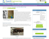
Vision is the primary sense of many animals and much is known …
Vision is the primary sense of many animals and much is known about how vision is processed in the mammalian nervous system. One distinct property of the primary visual cortex is a highly organized pattern of sensitivity to location and orientation of objects in the visual field. But how did we learn this? An important tool is the ability to design experiments to map out the structure and response of a system such as vision. In this activity, students learn about the visual system and then conduct a model experiment to map the visual field response of a Panoptes robot. (In Greek mythology, Argus Panoptes was the "all-seeing" watchman giant with 100 eyes.) A simple activity modification enables a true black box experiment, in which students do not directly observe how the visual system is configured, and must match the input to the output in order to reconstruct the unseen system inside the box.
The students will be using real life data to create and analyze …
The students will be using real life data to create and analyze histograms. They will be surveying their classmates and using data from other grade levels to compare same topic information in a histogram.
Richland Community College provides a glossary of many terms that are needed …
Richland Community College provides a glossary of many terms that are needed in order to understand statistics graphs and charts. Each of the types of charts is quickly explained in terms of what it is most effective in displaying.
Students explore how adjusting the bin width or adding, deleting, or moving …
Students explore how adjusting the bin width or adding, deleting, or moving data values affects a histogram.Students use the Histogram interactive to explore how the bin width can affect how the data are displayed and interpreted. Students also explore how adjusting the line plot affects the histogram.Key ConceptsAs students learned in the last lesson, a histogram shows data in intervals. It shows how much data is in each bin, but it does not show individual data. In this lesson, students will see that the same histogram can be made with different sets of data. Students will also see that the bin width can greatly affect how the histogram looks.Goals and Learning ObjectivesExplore what the shape of the histogram tells us about the data set and how the bin width affects the shape of the histogram.Clarify similarities and differences between histograms and line plots.Compare a line plot and histogram for the same set of data.
Harry keeps track of the number of times he sneezes in certain …
Harry keeps track of the number of times he sneezes in certain locations to try to diagnose the cause of his allergy in this video segment from Cyberchase.
Distributions and Variability Type of Unit: Project Prior Knowledge Students should be …
Distributions and Variability
Type of Unit: Project
Prior Knowledge
Students should be able to:
Represent and interpret data using a line plot. Understand other visual representations of data.
Lesson Flow
Students begin the unit by discussing what constitutes a statistical question. In order to answer statistical questions, data must be gathered in a consistent and accurate manner and then analyzed using appropriate tools.
Students learn different tools for analyzing data, including:
Measures of center: mean (average), median, mode Measures of spread: mean absolute deviation, lower and upper extremes, lower and upper quartile, interquartile range Visual representations: line plot, box plot, histogram
These tools are compared and contrasted to better understand the benefits and limitations of each. Analyzing different data sets using these tools will develop an understanding for which ones are the most appropriate to interpret the given data.
To demonstrate their understanding of the concepts, students will work on a project for the duration of the unit. The project will involve identifying an appropriate statistical question, collecting data, analyzing data, and presenting the results. It will serve as the final assessment.
This lesson plan introduces quartiles and box plots. It contains an activity …
This lesson plan introduces quartiles and box plots. It contains an activity and discussion. Supplemental activities about how students can represent data graphically are also included.
Students make a histogram of their typical-student data and then write a …
Students make a histogram of their typical-student data and then write a summary of what the histogram shows.Students are introduced to histograms, using the line plot to build them. They investigate how the bin width affects the shape of a histogram. Students understand that a histogram shows the shape of the data, but that measures of center or spread cannot be found from the graph.Key ConceptsA histogram groups data values into intervals and shows the frequency (the number of data values) for each interval as the height of a bar.Histograms are similar to line plots in that they show the shape and distribution of a data set. However, unlike a line plot, which shows frequencies of individual data values, histograms show frequencies of intervals of values.We cannot read individual data values from a histogram, and we can't identify any measures of center or spread.Histograms sometimes have an interval with the most data values, referred to as the mode interval.Histograms are most useful for large data sets, where plotting each individual data point is impractical.The shape of a histogram depends on the chosen width of the interval, called the bin width. Bin widths that are too large or too small can hide important features of the data.Goals and Learning ObjectivesLearn about histograms as another tool to describe data.Show that histograms are used to show the shape of the data for a wider range of data.Compare a line plot and histogram for the same set of data.
No restrictions on your remixing, redistributing, or making derivative works. Give credit to the author, as required.
Your remixing, redistributing, or making derivatives works comes with some restrictions, including how it is shared.
Your redistributing comes with some restrictions. Do not remix or make derivative works.
Most restrictive license type. Prohibits most uses, sharing, and any changes.
Copyrighted materials, available under Fair Use and the TEACH Act for US-based educators, or other custom arrangements. Go to the resource provider to see their individual restrictions.