GalleryCreate a Data SetStudents will create data sets with a specified mean, …
GalleryCreate a Data SetStudents will create data sets with a specified mean, median, range, and number of data values.Bouncing Ball Experiment How high does the class think a typical ball bounces (compared to its drop height) on its first bounce? Students will conduct an experiment to find out.Adding New Data to a Data Set Given a data set, students will explore how the mean changes as they add data values.Bowling Scores Students will create bowling score data sets that meet certain criteria with regard to measures of center.Mean Number of Fillings Ten people sit in a dentist's waiting room. The mean number of fillings they have in their teeth is 4, yet none of them actually have 4 fillings. Students will explain how this situation is possible.Forestland Students will examine and interpret box plots that show the percentage of forestland in 20 European countries.What's My Data?Students will create a data set that fits a given histogram and then adjust the data set to fit additional criteria.What's My Data 2? Students will create a data set that fits a given box plot and then adjust the data set to fit additional criteria.Compare Graphs Students will make a box plot and a histogram that are based on a given line plot and then compare the three graphs to decide which one best represents the data.Random Numbers What would a data set of randomly generated numbers look like when represented on a histogram? Students will find out!No Telephone? The U.S. Census Bureau provides state-by-state data about the number of households that do not have telephones. Students will examine two box plots that show census data from 1960 and 1990 and compare and analyze the data.Who Is Taller?Who is taller—the boys in the class or the girls in the class? Students will find out by separating the class height data gathered earlier into data for boys and data for girls.
This multimedia Learn Alberta math resource focuses on graphing data. In the …
This multimedia Learn Alberta math resource focuses on graphing data. In the video portion, students will see how math is involved in the display of merchandise in stores. The accompanying interactive component provides an exploration and comparison of a variety of graph types, namely line graphs, bar graphs, and circle graphs. Students will need to assess whether different graphs represent the same data. Be sure to follow the link to the printable activity included to reinforce target skills.
Decide which charts and graphs represent the number of goals two football …
Decide which charts and graphs represent the number of goals two football teams scored in fifteen matches. This data handling activity is designed to get children talking meaningfully about mathematics, presenting and justifying arguments, and is aimed at primary school pupils at Key Stage 2.
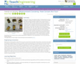
Students learn about the statistical analysis of measurements and error propagation, reviewing …
Students learn about the statistical analysis of measurements and error propagation, reviewing concepts of precision, accuracy and error types. This is done through calculations related to the concept of density. Students work in teams to each measure the dimensions and mass of five identical cubes, compile the measurements into small data sets, calculate statistics including the mean and standard deviation of these measurements, and use the mean values of the measurements to calculate density of the cubes. Then they use this calculated density to determine the mass of a new object made of the same material. This is done by measuring the appropriate dimensions of the new object, calculating its volume, and then calculating its mass using the density value. Next, the mass of the new object is measured by each student group and the standard deviation of the measurements is calculated. Finally, students determine the accuracy of the calculated mass by comparing it to the measured mass, determining whether the difference in the measurements is more or less than the standard deviation.
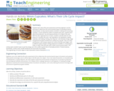
Students learn about life-cycle assessment and how engineers use this technique to …
Students learn about life-cycle assessment and how engineers use this technique to determine the environmental impact of everyday products and processes. As they examine what’s involved in making and consuming cupcakes, a snack enjoyed by millions of people every year, students learn about the production, use and disposal phases of an object’s life cycle. With the class organized into six teams, students calculate data for each phase of a cupcake’s life cycle—wet ingredients, dry ingredients, baking materials, oven baking, frosting, liner disposal—and calculate energy usage and greenhouse gases emitted from making one cupcake. They use ratios and fractions, and compare options for some of the life-cycle stages, such as different paper wrapper endings (disposal to landfills or composting) in order to make a life-cycle plan with a lower environmental impact. This activity opens students’ eyes to see the energy use in the cradle-to-grave lives of everyday products. Pre/post-quizzes, worksheets, activity cards, Excel® workbook and visual aids are provided.
(Nota: Esta es una traducción de un recurso educativo abierto creado por …
(Nota: Esta es una traducción de un recurso educativo abierto creado por el Departamento de Educación del Estado de Nueva York (NYSED) como parte del proyecto "EngageNY" en 2013. Aunque el recurso real fue traducido por personas, la siguiente descripción se tradujo del inglés original usando Google Translate para ayudar a los usuarios potenciales a decidir si se adapta a sus necesidades y puede contener errores gramaticales o lingüísticos. La descripción original en inglés también se proporciona a continuación.)
Este módulo de 10 días se basa en conceptos de grado 2 sobre datos, gráficos y parcelas de línea. Los dos temas en este módulo se centran en generar y analizar datos categóricos y de medición. Al final del módulo, los estudiantes están trabajando con una mezcla de gráficos de imágenes escalados, gráficos de barras y gráficos de línea para resolver problemas utilizando datos categóricos y de medición.
Encuentre el resto de los recursos matemáticos de Engageny en https://archive.org/details/engageny-mathematics.
English Description: This 10-day module builds on Grade 2 concepts about data, graphing, and line plots. The two topics in this module focus on generating and analyzing categorical and measurement data. By the end of the module, students are working with a mixture of scaled picture graphs, bar graphs, and line plots to problem solve using both categorical and measurement data.
Find the rest of the EngageNY Mathematics resources at https://archive.org/details/engageny-mathematics.
A companion site to Nova's film that examines "human populations and environments." …
A companion site to Nova's film that examines "human populations and environments." Find some fascinating facts in the interactive slide shows "Human Numbers Through Time," and "Global Trends Quiz."
The Ocean Planet exhibit at the Smithsonian explains the general features of …
The Ocean Planet exhibit at the Smithsonian explains the general features of ocean circulation. A general look at upwelling, deep water, and currents are combined for an overall view.
Learn about organizing and interpreting data with the Odd Squad. The agents …
Learn about organizing and interpreting data with the Odd Squad. The agents have to organize their data about the escaped literary characters. Olive, Otto and Oscar visit the Mathroom to chart their results and interpret the data.
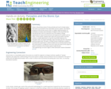
Vision is the primary sense of many animals and much is known …
Vision is the primary sense of many animals and much is known about how vision is processed in the mammalian nervous system. One distinct property of the primary visual cortex is a highly organized pattern of sensitivity to location and orientation of objects in the visual field. But how did we learn this? An important tool is the ability to design experiments to map out the structure and response of a system such as vision. In this activity, students learn about the visual system and then conduct a model experiment to map the visual field response of a Panoptes robot. (In Greek mythology, Argus Panoptes was the "all-seeing" watchman giant with 100 eyes.) A simple activity modification enables a true black box experiment, in which students do not directly observe how the visual system is configured, and must match the input to the output in order to reconstruct the unseen system inside the box.
No restrictions on your remixing, redistributing, or making derivative works. Give credit to the author, as required.
Your remixing, redistributing, or making derivatives works comes with some restrictions, including how it is shared.
Your redistributing comes with some restrictions. Do not remix or make derivative works.
Most restrictive license type. Prohibits most uses, sharing, and any changes.
Copyrighted materials, available under Fair Use and the TEACH Act for US-based educators, or other custom arrangements. Go to the resource provider to see their individual restrictions.